Paraigua
Brand Creation for decorative straws that also cover your drink.
About the Brand
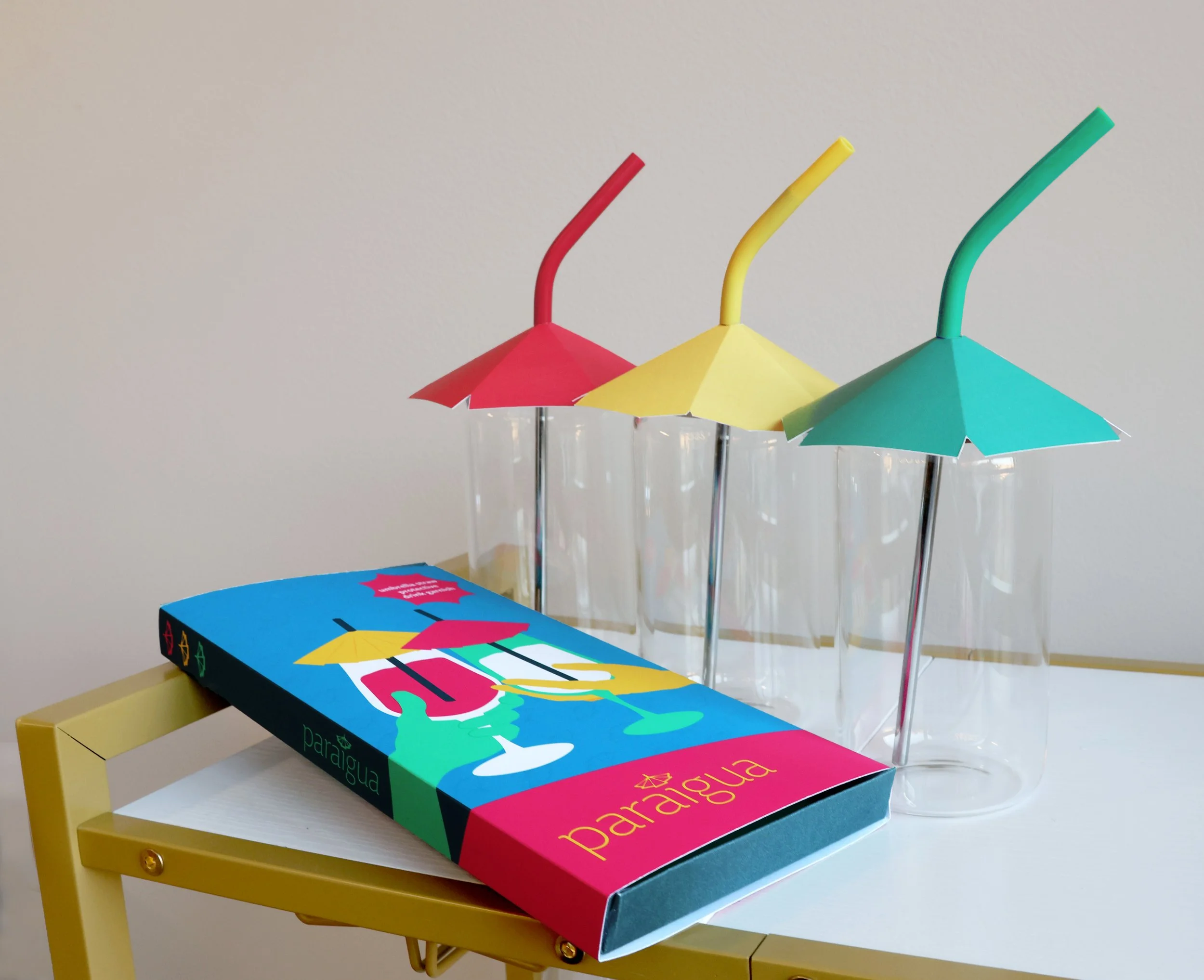
Paraigua is a brand imagined to protect your drinks from the elements. It allows users to have a decorative garnish in their beverage, while also making sure that nothing additional can fall in. The packaging is bright and colorful to inspire fun and comfort throughout the brand.
The name “Paraigua” is the Catalan word for “umbrella”. It was chosen because of the way the letter forms match up with one another. Additionally, the prefix “para-” can be connected to the word “parasol”, meaning umbrella, and the ending letter forms “aigua” are reminiscent of the word “agua”, meaning water. Together, the word as a whole alludes to the nature of an umbrella covering liquids.
This brand was created for anyone to enjoy and protect their drink in whatever setting they most see fit.
Black and White Logo
Color Variation Logo
Mark Only
Brand In Use
Colors
Blue
008CB5
C:82 M:32 Y:17 K:0
Dark Blue
003D4F
C:97 M:67 Y:49 K:0
Yellow
FFCF4F
C:0 M:18 Y:80 K:0
Dark Yellow
F2B838
C:4 M:29 Y:91 K:0
Green
00D99C
C:66 M:0 Y:57 K:0
Dark Green
12B285
C:77 M:2 Y:64 K:0
Pink
EE366E
C:0 M:92 Y:35 K:0
Dark Pink
E31F69
C:0 M:100 Y:32 K:0
Typography
spacing
Proper spacing for this logo suggests that there is at least one umbrella mark of space in each direction.
Process
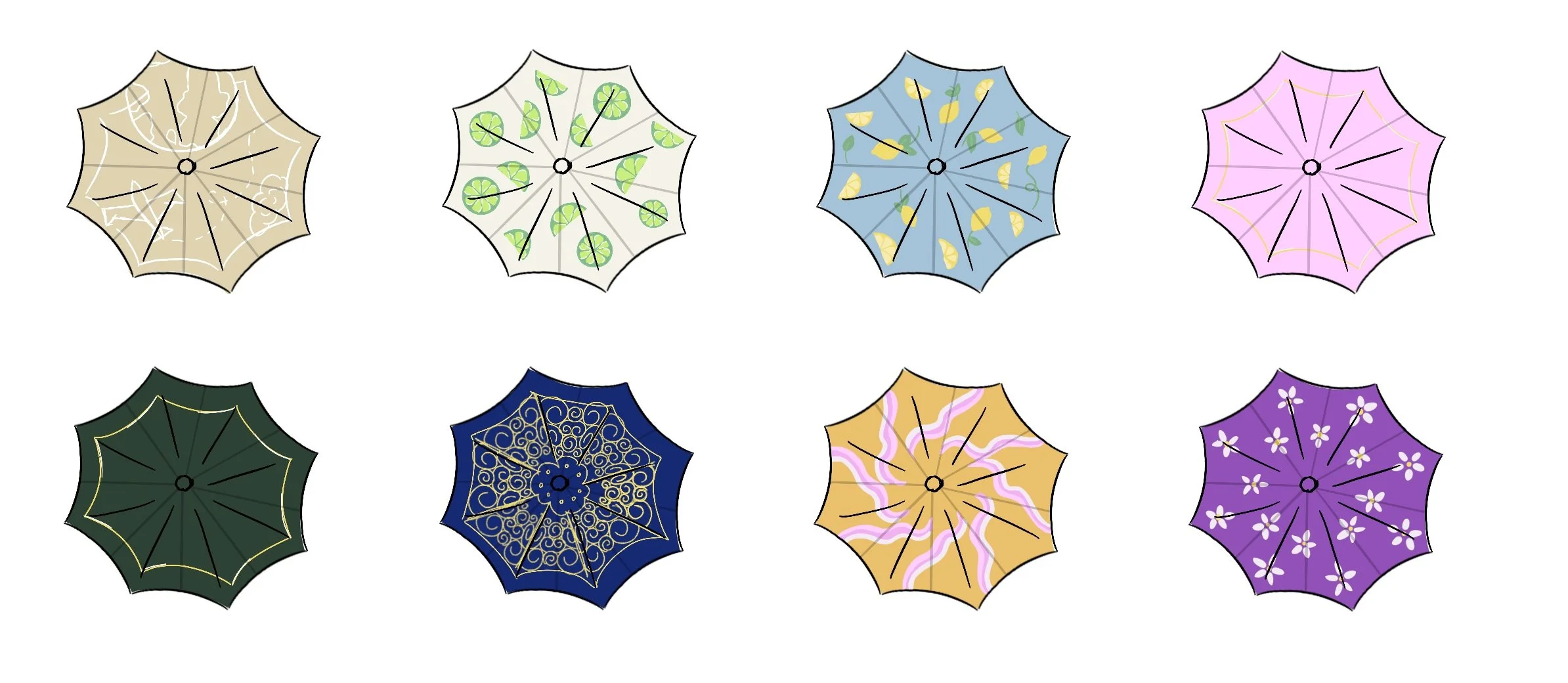
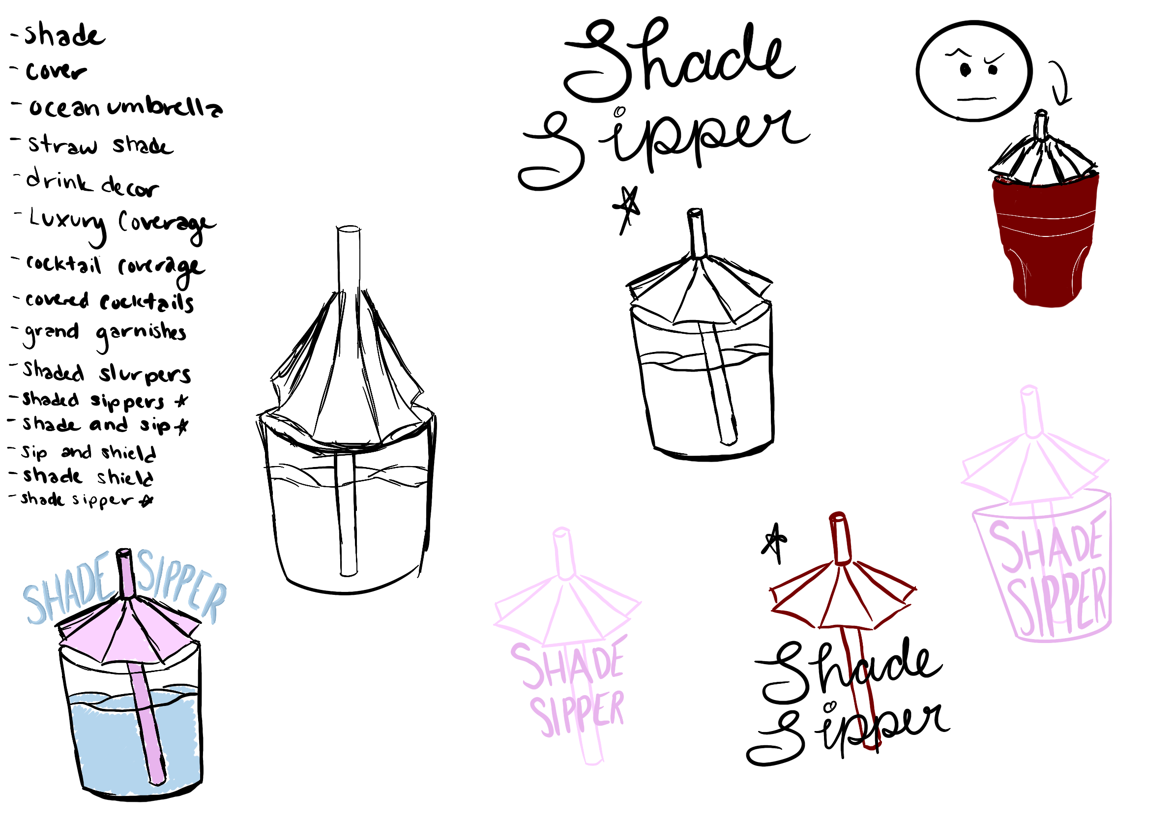
In this project, the initial goal was to find a way to make umbrella drink garnishes sustainable. The most straightforward way to do this would be to make them reusable. However, as small as they are, they would probably end up being thrown away anyway. This is where the addition of the straw came in. If the straw and umbrella are attached, they are given the additional function of actually protecting one’s drink.
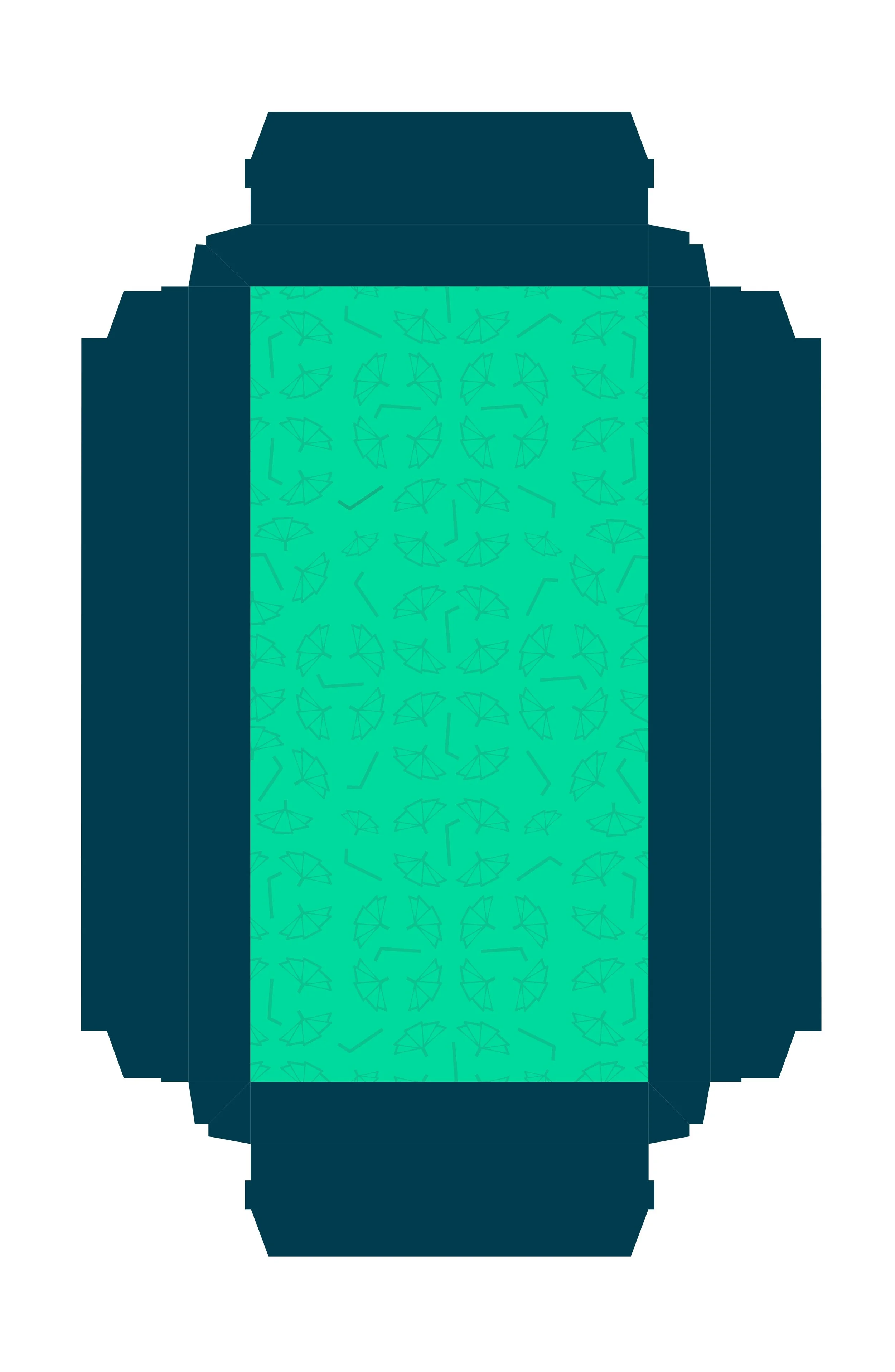
Choosing the brand direction for this was difficult due to the fear of marketing of it too far as a safety tool and eliminating the fun, decorative aspect, or having the same issue vis versa. Elements of the design such as the traffic light color scheme on the side of the packaging and the descriptions on the back allude to the safety benefits without making the product too intensely safety-oriented that it drives other potential users away. The color scheme was chosen to highlight the fun and decorative aspects of the brand. Seeing this project come to life through its packaging and branding has been a very rewarding experience for me.
Credits
Art Direction: Jenny Kowalski
Tool: Adobe Illustrator, Adobe InDesign, Coolors
Inspiration: Malika Favre
Inspiration: Cocktail Umbrellas
Inspiration: Metal Straws
Inspiration: Hydroflask Straw Design


