Type Specimen Book: Brandon Grotesque
Inspiration
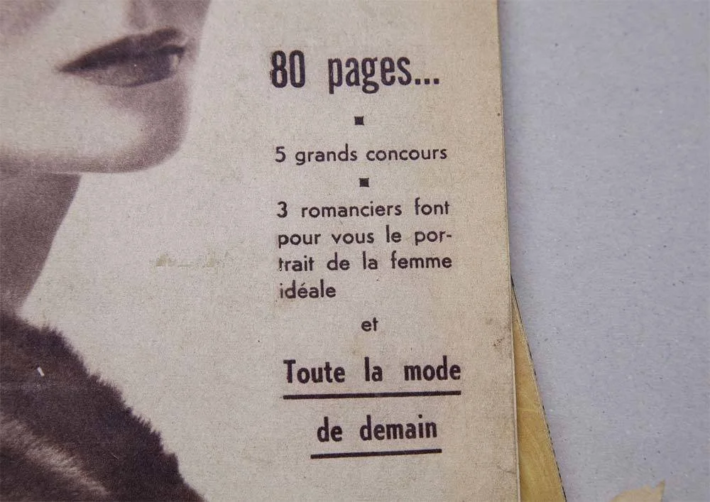
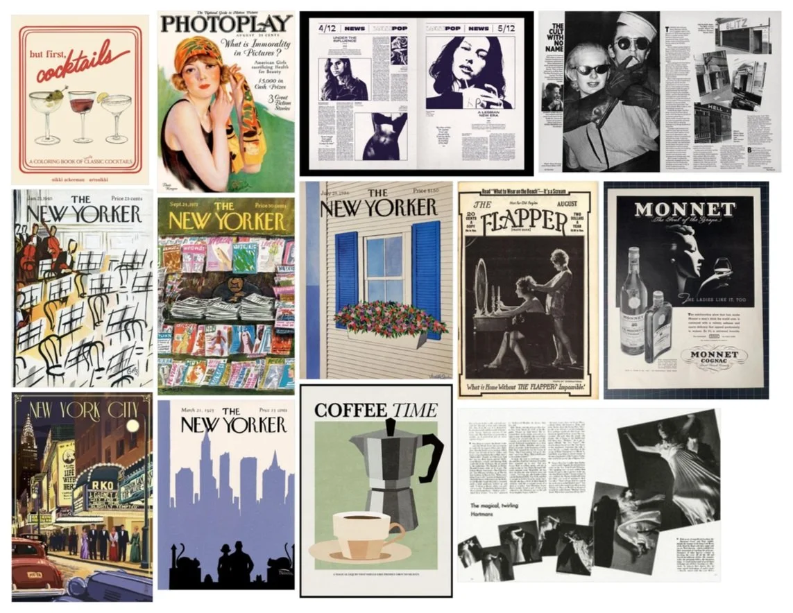
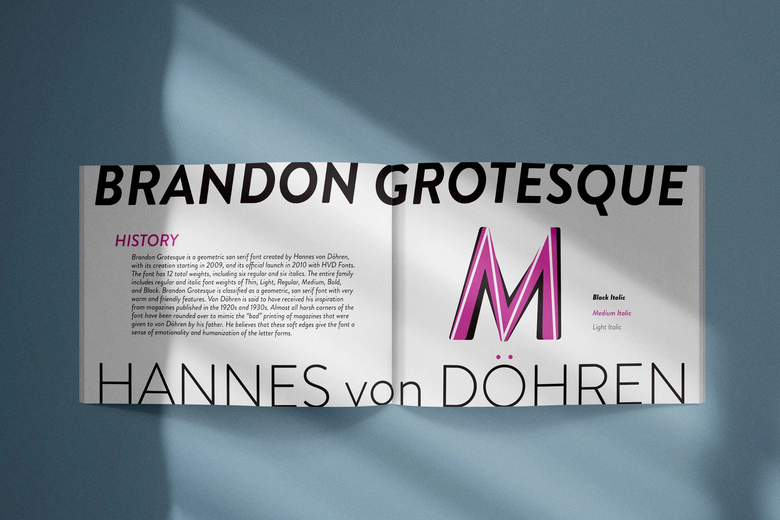
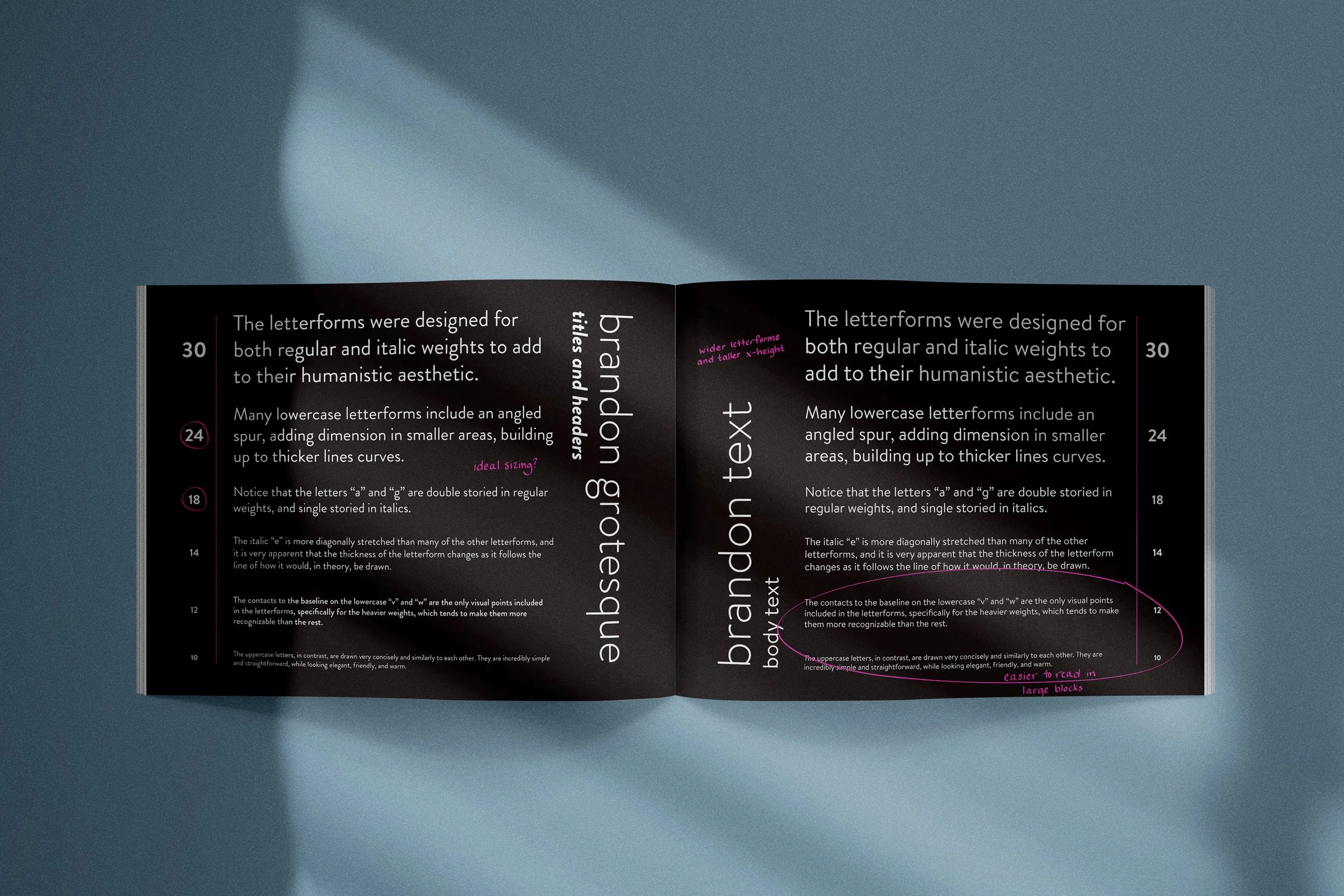
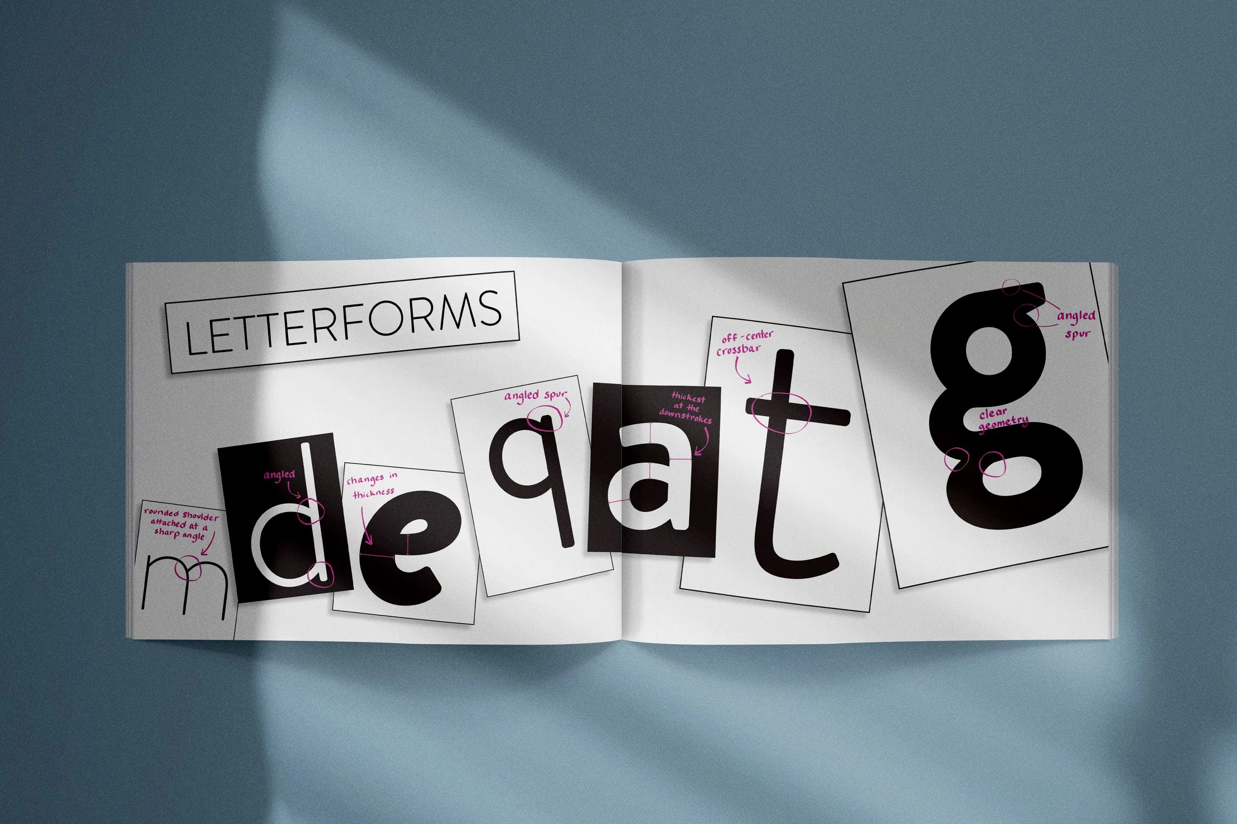
I was drawn to the font Brandon Grotesque because of its friendly, yet bold and confident nature. I could feel the personality within this font, and when I learned that it was modeled after the printing quality of old magazines, I was immediately inspired and intrigued to see if I could mimmic this vintage and chic style in a type specimen book. The writing, photography, logo, and product mock ups were all created with the intention to recreate the aesthetic of a humanistic, pieced together, print magazine. I also decided early on to include my hand writing in the final product in order to contribute to that same humanistic and paper magazine aesthetic.
Cover Shoot
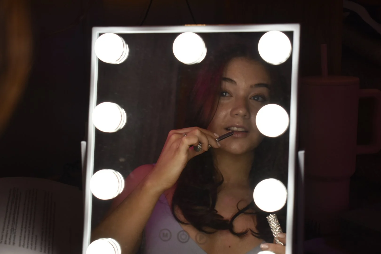
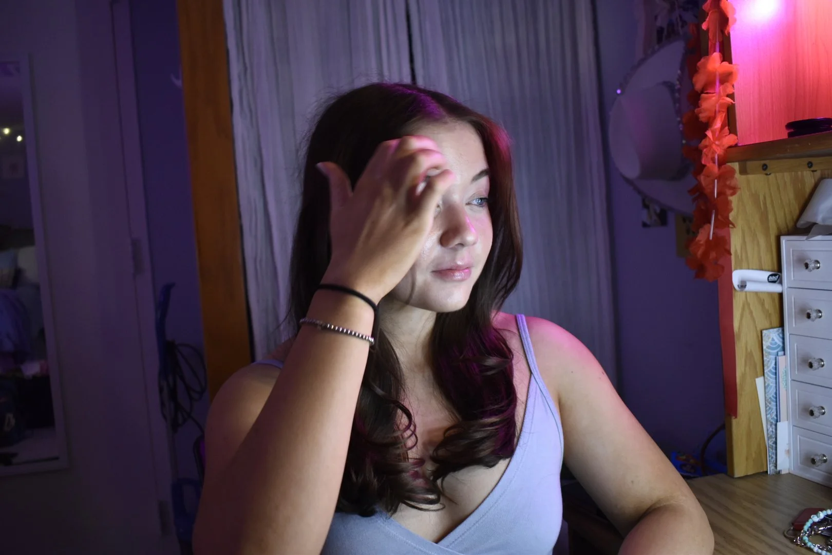
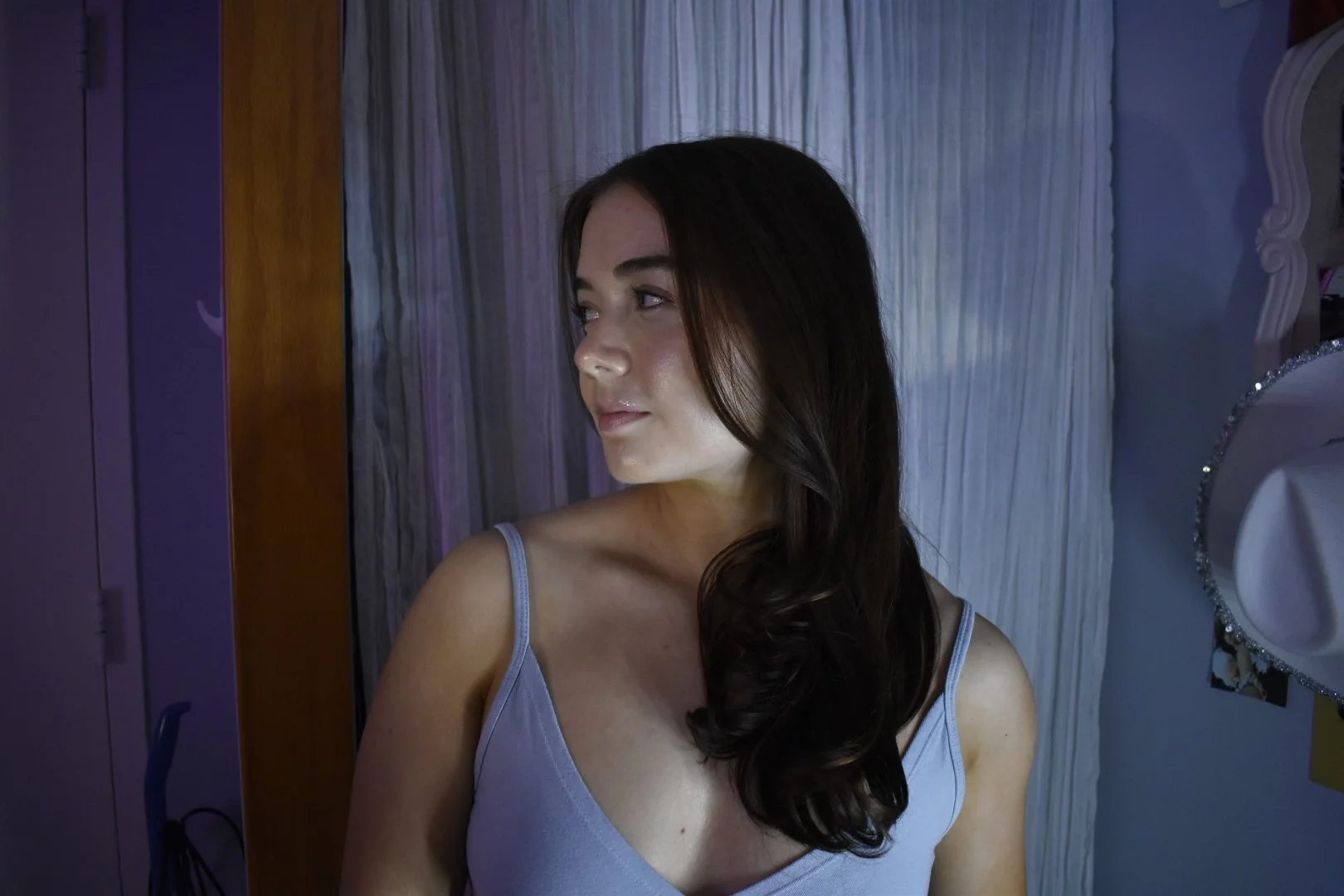
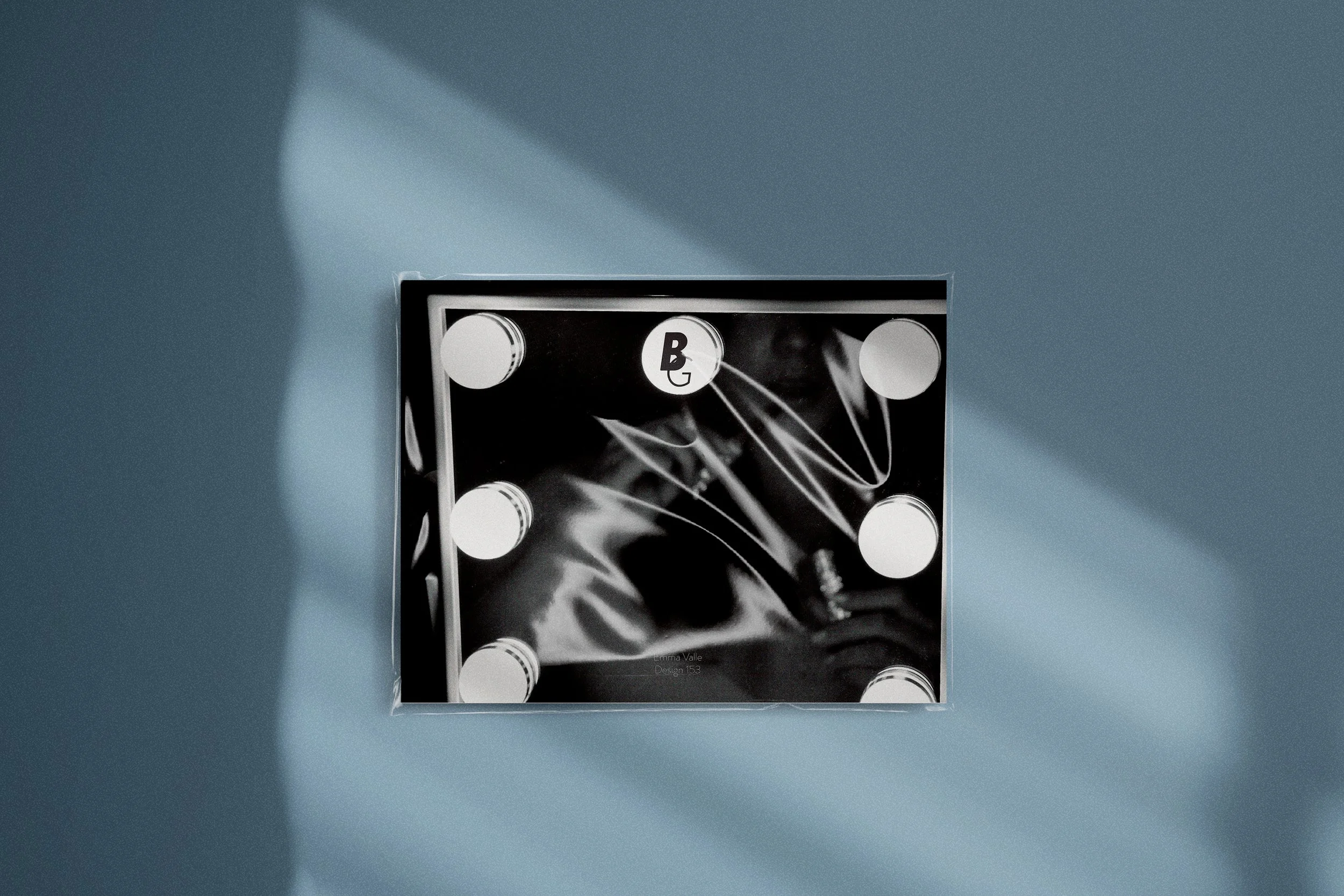
For the front and back cover of the type specimen book, I let Hannes von Döhren’s inspiration guide my work as well. I staged a photoshoot in which I gave my model various props from around the dorm, or directed her to hit certain poses. Later, the images were taken to Adobe Photoshop where they were made to fit the theme of the book.
Case Studies
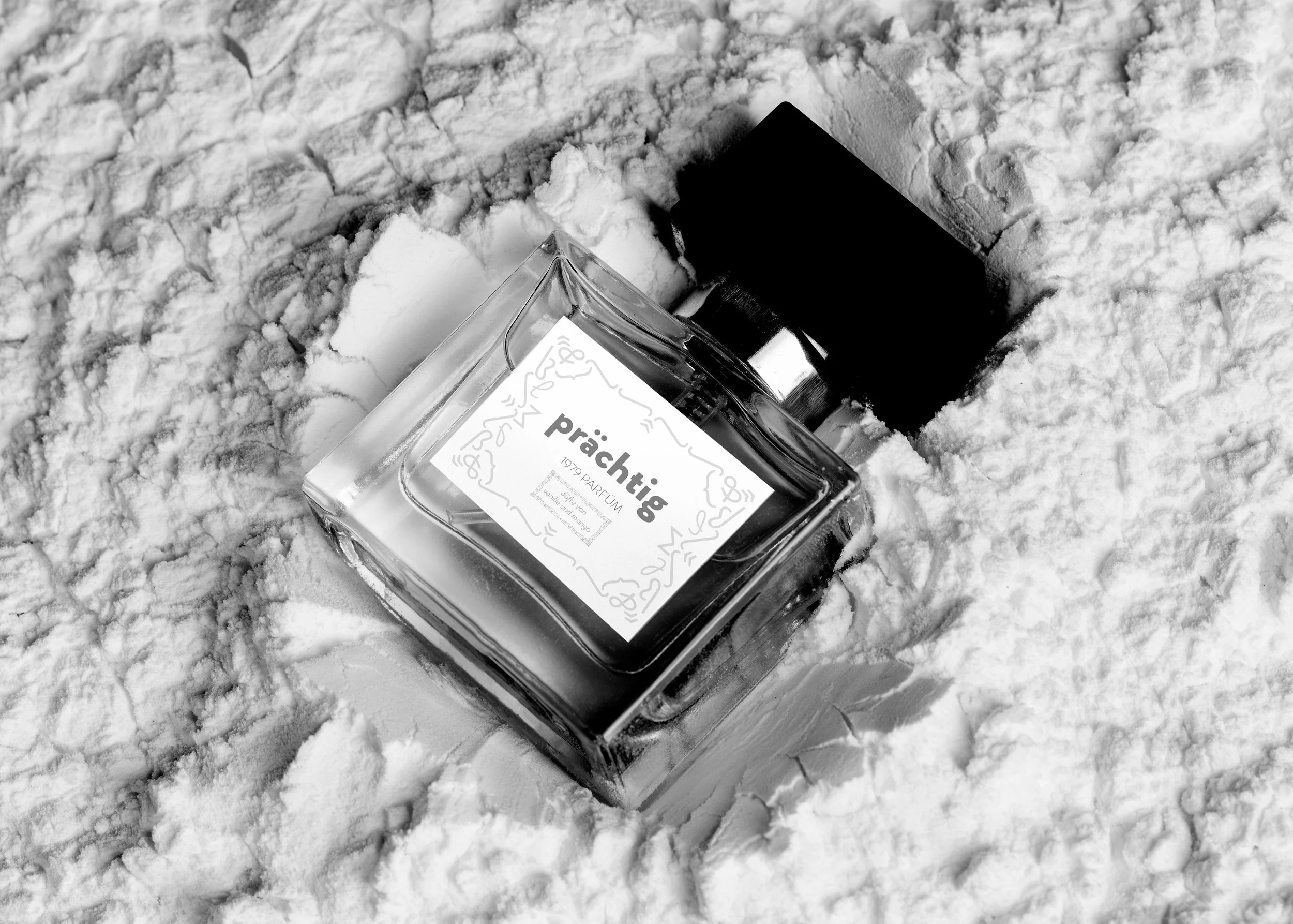
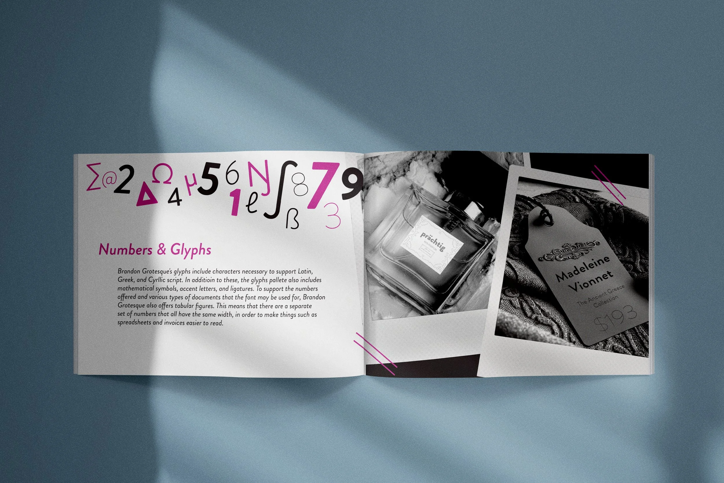
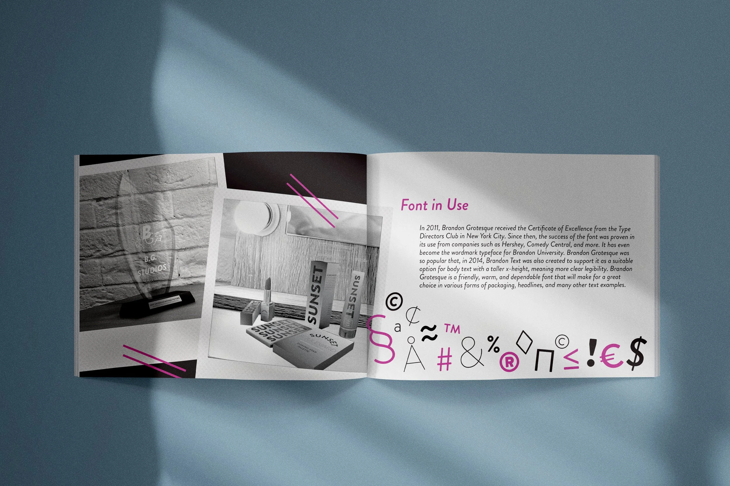
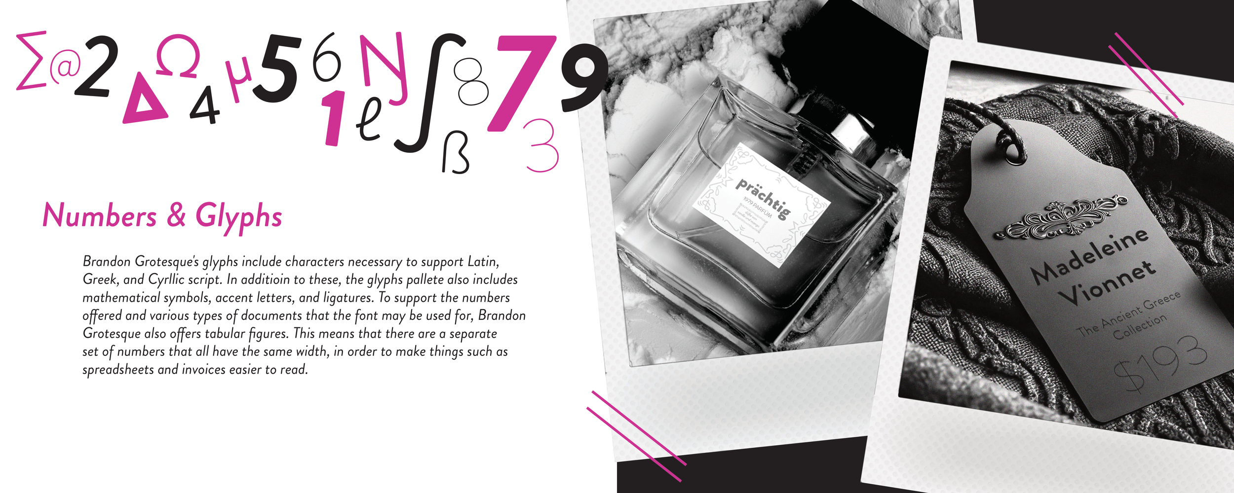
All of the “Font in Use” case studies that appeared in this book were created solely from glyphs within the font family of Brandon Grotesque. For many of these, I pieced together different mock ups and images from Adobe Stock, and used Adobe Photoshop to bring them to life. After I was confident in the way they came together, I would put the complete case study into a polaroid picture frame so that the book would have the pieced-together look I was going for.


